Differences Between Linear Gradients and Perceptual Gradients
In Adobe Illustrator, gradients are a fundamental color tool used to create smooth transitions between hues, commonly applied in backgrounds, illustrations, and graphic design.
However, built-in gradient tools may produce uneven transitions, resulting in muddy or grayish midtones, or visible banding. This is typically caused by the way color interpolation is calculated.
This article examines Illustrator’s standard linear gradients and introduces alternative methods based on perceptual color spaces (such as OKLAB), to clarify the visual differences between these approaches.
Limitations of Native Tools: Unnatural Color Transitions in Linear Gradients
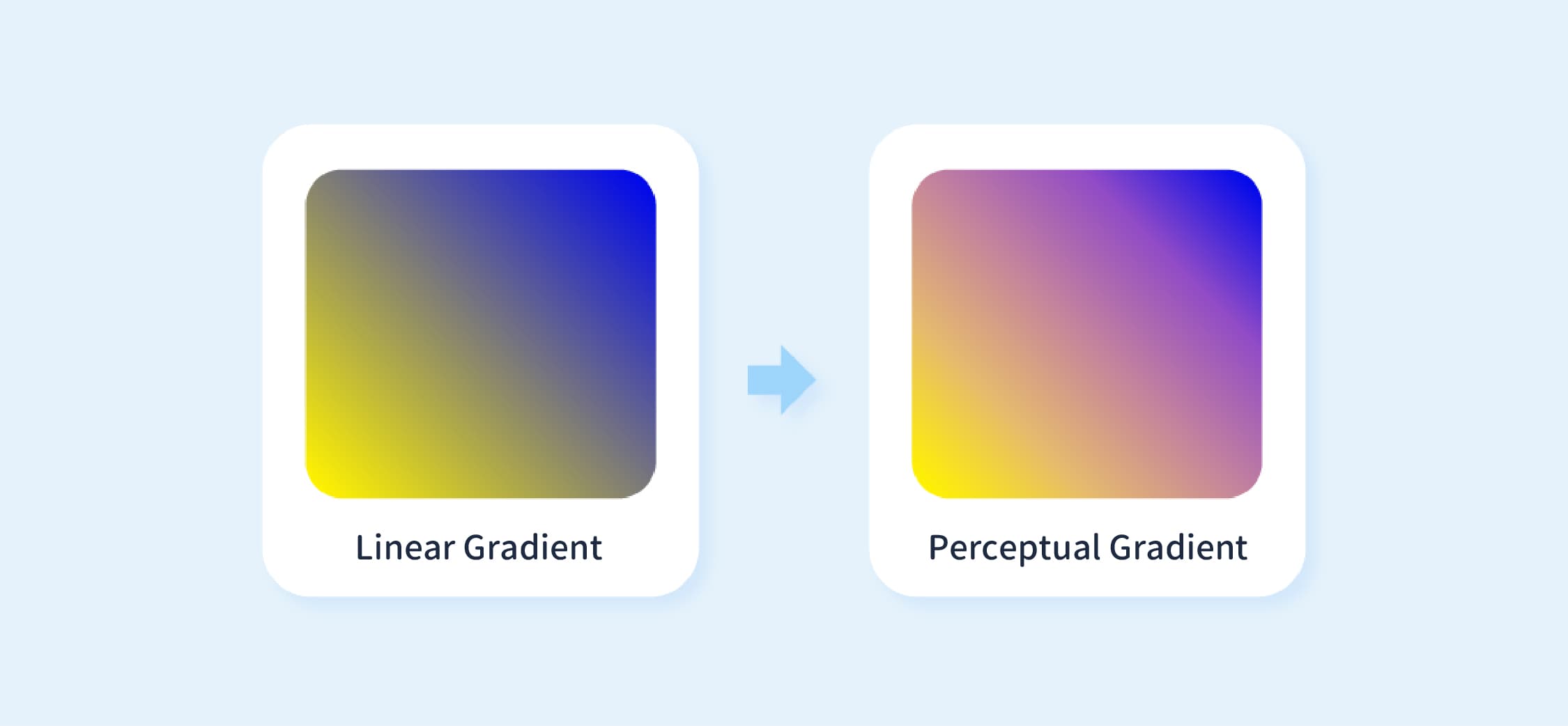
Illustrator’s native gradients use linear RGB interpolation to calculate color transitions.
When two colors are defined (such as yellow and blue), the system blends them by linearly scaling values across the Red (R), Green (G), and Blue (B) channels.
However, this approach often produces visually unnatural results. Common issues include:
Muddy Midtones ("Dead Zone") :
When blending two highly saturated colors, transitional hues may appear gray or muddy, causing the gradient to look dull and less vibrant.Color Banding:
When there is a significant contrast or sharp brightness difference between two colors, the gradient may appear stepped or choppy rather than smooth.Non-Uniform Luminance Transition:
Although colors are blended linearly in numerical terms, human perception of brightness is non-linear. This can cause certain areas to appear unexpectedly bright or dark, resulting in uneven transitions.

🔼 Image Source: https://css-tricks.com/the-gray-dead-zone-of-gradients/
To address these muddy transitions, additional color stops are typically inserted manually into the gradient.
However, this approach requires iterative adjustments, making it time-consuming and not always able to produce optimal results.
Perceptual Gradients: Color Transitions That Better Match Human Vision
Unlike standard linear RGB blending, perceptual gradients (also known as sensory or cognitive gradients) use perceptual color spaces to calculate color transitions. Common examples include CIELAB and the more recent Oklab.
The CIELAB color space is designed to align with human visual perception. It represents color using three distinct channels:
L (Lightness):
Represents perceptual brightness, ranging from 0 (pure black) to 100 (pure white).a (Green–Red):
Represents the color axis from green to red.b (Blue–Yellow):
Represents the color axis from blue to yellow.
In a perceptual gradient, the system first converts the start and end colors into the Lab color space. The transition is then computed within this space before being converted back to RGB for display.
Take Oklab as an example—a perceptual color space that has gained significant popularity in recent years. Compared to CIELAB, it offers improved color uniformity.
This means that changes in color values more closely align with human visual perception, resulting in gradients that appear more natural.
What Problems Does This Solve?
Smoother Transitions:
Because color transitions are computed in the Lab color space, blending aligns more closely with human vision. As a result, gradients appear smoother and are less prone to muddiness or banding.More Uniform Luminance:
In the Lab color space, Lightness (L) is an independent component. This helps maintain consistent brightness throughout the gradient, reducing sudden bright spots or dark dips.Better Saturation Retention:
When blending highly saturated colors, intermediate hues retain more of their vibrancy, avoiding the desaturation commonly seen in linear RGB gradients.
This approach has already been integrated into several design tools. For example, Adobe Photoshop supports gradient calculations based on the Lab color space.
However, Adobe Illustrator still primarily relies on RGB for its gradient engine. As a result, designers may need to use alternative methods to refine gradients in certain scenarios.
Practical Benefits of Perceptual Gradients for Designers
Implementing perceptual gradients leads to several practical improvements in design workflows:
More Natural Gradient Effects:
Color transitions appear smoother and are less prone to banding or muddiness, resulting in more stable and consistent color performance across logos, illustrative backgrounds, and UI components.Reduced Manual Adjustment Time:
Creating gradients traditionally requires manually adding intermediate color stops to correct transition issues. Perceptual gradients reduce the need for such adjustments.Greater Freedom to Experiment with Color:
With more stable transitions, designers can explore a wider range of color combinations with greater confidence, without spending excessive time correcting midtone issues.
In certain scenarios, Illustrator’s native linear gradients may produce less natural transitions. By using perceptual color spaces such as Oklab, color blending can more closely align with human visual perception, resulting in smoother and more vibrant gradients.
For gradient-intensive design work, these approaches serve as a useful supplement, improving visual quality while reducing the need for manual adjustments.